
 If you follow this blog, you know that last week we released an important change to our look and feel. The post focused on the ability to quickly look at a series of pinned attributes to have a sense of where someone is on your discipleship profile spectrum.
As you can see it gives a picture of their involvement with just a glance. And it's fully customizable to accommodate the attributes you define as discipleship measures. (Check out the Discipleship Signs series for more on that.)
But, if you logged in as a guest or client since last Tuesday, you noticed a whole lot more of the color scheme was changed than just responses to pinned member attributes. Here are a couple of examples.
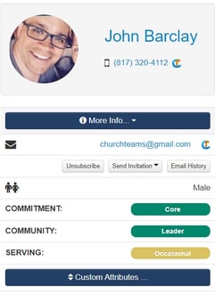
Group Info. Darker blue buttons. Color attributes in dashboard.
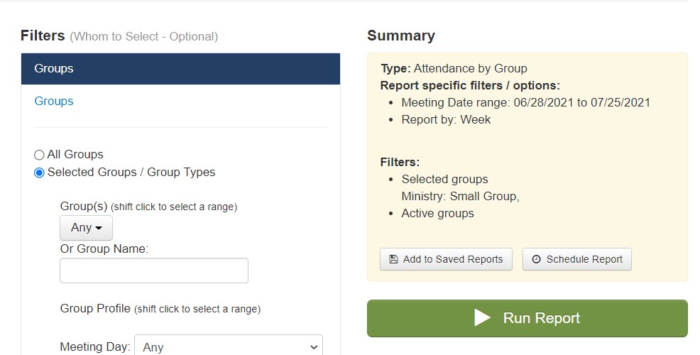
Report Summary. Darker header & summary text. Warmer green.
Changes like these are everywhere giving the User Interface a different, calmer, more friendly feel. But why is this a big deal?
I did a little research into that question and thought you might find this information interesting for your church as well.
Jill Morton is the CEO of a small consulting firm called Colorcom. I found these three research findings especially interesting in her article on Why Color Matters.
92.6 percent said that they put most importance on visual factors when purchasing products.
84.7 percent of respondents think that color accounts for more than half among the various factors important for choosing products.
Research reveals people make a subconscious judgment about a person, environment, or product within 90 seconds of initial viewing and that between 62 and 90 percent of that assessment is based on color alone.
Here is my synopsis of these:
- People respond to what they see more than any other sense.
- They decide if they like it quickly. 90 seconds or less.
- Color is the major factor in their choice.
Biblical hospitality and respect require us to think of others needs above our own (Phil. 2:4). This means looking at our environments through their eyes. What do they see? What does that mean to them? Do they feel prepared for and welcome?
Every time someone attends your church, views your website, or logs in to our software, they make an immediate judgment about you. This will influence whether first time guests return or not. It will also impact the retention of many regular attenders and members who are always evaluating whether they belong or not.
You've likely thought of all these things related to the clarity of signage, cleanliness of bathrooms, and absence of clutter. But, what about color? What do the colors you are using communicate? How do they make people feel? If those colors are the major factor in their impressions, it might be worth taking another look.
We've been working on UI changes in Churchteams for a long time and we will always be working to upgrade the look and feel of the system. By doing this we show you that we respect you and care about your experience with us whether as a client or as a guest. Either way, you are welcome here. In fact, you belong here.


